Notice: This Wiki is now read only and edits are no longer possible. Please see: https://gitlab.eclipse.org/eclipsefdn/helpdesk/-/wikis/Wiki-shutdown-plan for the plan.
JavaEE Perspective UIWG Walkthrough
Contents
Java EE Perspective UI Walkthrough Eclipse UI Best Practices Working Group 10/15/2008
Prep/Homework
- Some important enhancements bug to look at:
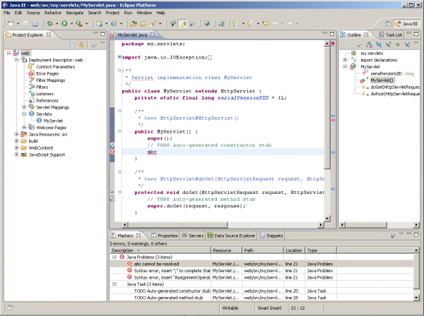
- Take a look at some screenshots with suggested changes.
Discussion Topics
- In this call we should discuss how to tune the Java EE perspective in a way that it is more efficient for both groups of first-time users and experienced users.
Discussion Notes from Walkthrough
- According to the user data collector statistics:
- Navigator's view has most clicks
- minimized views are not found easily by users
- having one vertical stack per docking side seems to be preferable than having more stacks
- It is better to show more views by default rather than less. Otherwise beginner users may miss some great functionality that can improve their experience. It is very easy for more experienced users to close or minimize the views that they don't need.
- We should avoid dramatic changes in the layout. Otherwise we may attain only negative effect. Better do a evolution than a revolution.
- We should keep all major perspectives in sync. There are users that uses more than one perspective for development and significant difference in the layout may disturb them.
- We can ask WTP users in the newsgroups to share screenshots of their working environment. This could be a valuable input.
- Markers view:
- We could replace Problems and Tasks view with the more generic Markers view.
- Isn't this a step back?
- Actually not. This is a chance to reduce the number of stacks at the bottom docking side.
- The Java perspective is going to make this shift two.
- Project Explorer view:
- It is confusing that the Java perspective still uses the Package Explorer view. This is an inconsistency with other perspectives.
- Package Explorer still has better performance than the Project Explorer. It is hard to convince JDT to switch.
- There wasn't an owner for the Common Navigator for a long time. But there is such a person now. There is a chance that these performance issues can be addressed in the near future.
- Task List view
- Already included in the Java perspective stacked above the Outline view.
- It is not a good approach to have two stacks on the right. Better have them stacked together.
- Servers and Data Source Explorers view:
- Keep them at the bottom for now.
- Servers and Console view needs to be shown at the same time.
- One option is to have two horizontal view stacks sharing the bottom docking side.
- If at some point we have combined AppServer/DB view with vertical orientation we should stack it next to the Outline view.
- Snippets view:
- Anybody needs it? May be just adopters are able to utilize it in a meaningful way.
- It's better to keep it, because otherwise nobody will know about this view. Can be closed easily.
Conclusions/To-do's
We have decided to make some small steps in Galileo M3 towards improving the usability in the layout of the Java EE perspective:
- Replace the Problems and Tasks view with the Markers view.
- Introduce the Mylyn's Task List view stacked together with the Outline view.
Action items:
- meeting minutes and update the bug (Kaloyan)
- send usage report data statistics (Mik) - done: see comment in bug 238335.
- collect usage screenshots by WTP users (Kaloyan) - done: see JavaEE Perspective Usage Screenshots.
Other thoughts
[This section added just to capture quick notes from the meeting, from others, that don't appear to be captured elsewhere ... they probably are, just not obvious, but to make sure not lost this is a good place to put them until it's confirmed they are captured elsewhere.]

