Notice: This Wiki is now read only and edits are no longer possible. Please see: https://gitlab.eclipse.org/eclipsefdn/helpdesk/-/wikis/Wiki-shutdown-plan for the plan.
UI Walkthrough JavaEE Perspective
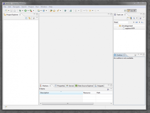
Current situation:
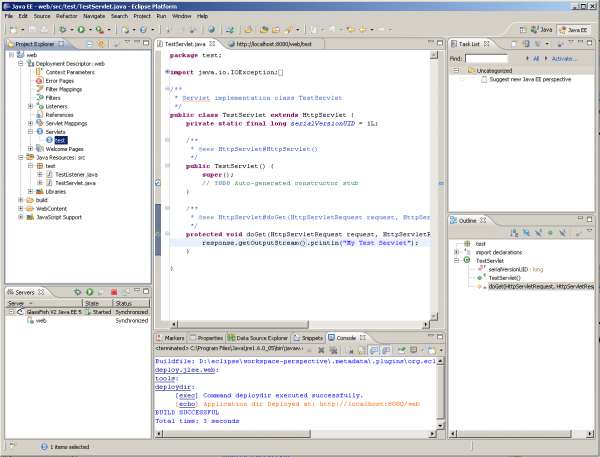
Initial proposal that triggered the discussion:
- add Mylyn's Task List view
- replace the Problem and Tasks view with the new Markers view
In addition to the above, move the Servers view from the bottom docking to the left-bottom docking.
- this makes possible to look at Servers and Console view in one and the same time.
- you also have both projects and servers on one and the same side of the workbench.
- this requires changes in the Servers view to have vertical orientation. See bug 247934.
Further evolution on the above:
- Dock the Snippets view, which has a natural vertical orientation, next to the Outline view.
- Dock the Data Source Explorer view, which has a natural vertical orientation, next to the Servers view.
- Dock the Mylyn's Task Lists view next to the Project Explorer view.
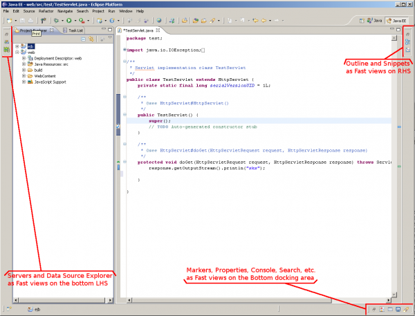
- In addition everything, except Project Explorer view may be minimized by default to preserve space for the editor. This is quite minimalistic approach, which could be suitable for advanced users, but may disturb beginners.
An alternative approach suggested was to make use of Fast views:


