Notice: This Wiki is now read only and edits are no longer possible. Please see: https://gitlab.eclipse.org/eclipsefdn/helpdesk/-/wikis/Wiki-shutdown-plan for the plan.
UI Graphics : Design : Consistency
Return to the main UI Graphics (3.x Updates) section on the UI Best Practices page.
This section encourages consistency and reuse of existing graphical elements by providing the core icon and wizard concepts currently in the tools.
In the development of the Eclipse style graphical elements, a visual language was formed to describe a variety of concepts in the user interface. These concepts are now represented by a large selection of tiny visual signs that many have come to know through using Eclipse-based tools.
In order to ensure a consistent visual experience, a common understanding of concepts across the tools, and to minimize confusion, we encourage you to re-use Eclipse-style graphical elements whenever possible.
Contents
Re-using graphical elements
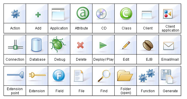
A great many icons and wizard graphics have already been created in the Eclipse visual style, so there is a good chance that the elements you might need already exist. Samples of existing core concepts for icons and wizard graphics are shown below. Each of these elements carries with it a specific meaning, so care should be taken when using them to ensure consistent meaning is maintained. A more extensive collection of common visual elements can be found on the Common Elements page.
Core icon concepts
Click here or on the image above to download the "core_icon_concepts.psd".
Core wizard graphic concepts
Click here or on the image above to download the "core_wizard_concepts.ai" and the "core_wizard_concepts.psd" files.
Click here to get a gimp version of the above file.
Checklist
Re-use the core visual concepts to maintain consistent representation and meaning across Eclipse plug-ins.

