Notice: This Wiki is now read only and edits are no longer possible. Please see: https://gitlab.eclipse.org/eclipsefdn/helpdesk/-/wikis/Wiki-shutdown-plan for the plan.
Riena/Look and Feel
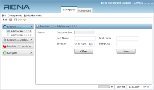
Riena provides a Look&Feel for the controls of the navigation. The Riena Look&Feel is similar to the Look&Feel of Swing. A Riena Look&Feel consists of a Look&Feel proper plus a Theme:
- The Theme
- provides the colors, fonts, images and some other settings.
- In the Look&Feel
- other renderers for some controls can be set.
Custom Look & Feel
In your own Look&Feel you must set your Theme and an ID.
The following steps are necessary:
- Extend the class RienaDefaultLnf
- Create and set the Theme
- Return the ID
Example:
public class ExampleLnf extends RienaDefaultLnf {

  public ExampleLnf() {
    super();
    setTheme(new ExampleTheme());
  }

  @Override
  protected String getLnfId() {
    return ExampleLnf;
  }

}
To set your custom Look&Feel, call the static method LnfManager.setLnf(lnf). We recommend that you call it in the constructor of the Riena Application (SwtApplication):
Example:
public SwtExampleApplication() {
  super();
  LnfManager.setLnf(new ExampleLnf());
}
Setting the custom LnF via Extension Point
Since Riena 3.0 it is also possible to set the LnF by configuring an Extension Point. So instead of setting the ExampleLnf via the LnfManager programmatically do this:
<extension
  point="org.eclipse.riena.ui.swt.defaultLnf">
  <lnf
    class="org.eclipse.riena.ui.swt.lnf.ExampleLnf">
  </lnf>
</extension>
Custom Theme
To write your own Theme you must implement the interface ILnfTheme. The interface has the following four methods, with which you define the colors, fonts, images and settings for the controls of the navigation:
addCustomColors(Map<String, ILnfResource> table)
addCustomFonts(Map<String, ILnfResource> table)
addCustomImages(Map<String, ILnfResource> table)
addCustomSettings(Map<String, Object> table)
It is recommended to extend the default theme of Riena, DefaultRienaTheme. All necessary resources and settings are already defined in the default theme. You must only put your own defaults into the tables of the Look&Feel.
For example, the following line specifies the background color of a sub-module:
table.put(ILnfKeyConstants.SUB_MODULE_BACKGROUND,new ColorLnfResource(186, 193, 225));
You can find all available keys for the Look&Feel in the interface ILnfKeyConstants. Note that it is not possible to add colors from the type org.eclipse.swt.graphics.Color; the colors must be wrapped from an instance of the class ColorLnfResource (this helps with correctly disposing the Look&Feel's resources). Wrappers for fonts and images exist as well.
Custom Renderer
For nearly every control of the navigation there is a renderer responsible for painting it. These renderers can be replaced by own implementations. To write your own renderer please extend an existing default renderer.
To set your own renderer you can use extensions. For this Riena provides an extension point org.eclipse.riena.ui.swt.lnfrenderer
This extension can only have renderer elements. A renderer element has the following three attributes:
- lnfkey
- Key of the Look&Feel for the renderer (see LnfKeyConstants)
- lnfid
- ID of your own Look&Feel (see getLnfId())
- class
- Class of the RendererExample
<extension point="org.eclipse.riena.ui.swt.lnfrenderer">
  <renderer class="org.eclipse.riena.example. application.ExampleModuleGroupRenderer"
            lnfid="ExampleLnf"
            lnfkey="ModuleGroup.renderer">
  </renderer>
</extension>
Look&Feel Keys
The class org.eclipse.riena.ui.swt.lnf.LnfKeyConstants defines a set of keys for the Look&Feel. These keys are used to access the color, fonts, images etc. of the Look&Feel.
Shell
The shell of the Riena application can be very different from other RCP applications. So it is possible to suppress the title bar and border of the operation system. Therefore the key SHELL_HIDE_OS_BORDER exists.
(Because it is possible to hide the title bar and border, all the other L&F keys for the Riena shell starts with TITLELESS_SHELL_.)
Sub-Application Switcher
The Riena application consists of one or more sub-applications. Only one sub-application can be active. The Sub-Application Switcher in the top of the application window allows you to switch between sub-applications:
- SUB_APPLICATION_SWITCHER_HORIZONTAL_TAB_POSITION
- Define the position of the switcher. Three values are valid: SWT.LEFT, SWT.CENTER, SWT.RIGHT.
- SUB_APPLICATION_SWITCHER_TAB_SHOW_ICON
- Set to "true" if an icon shall be displayed in front of every switcher's text.
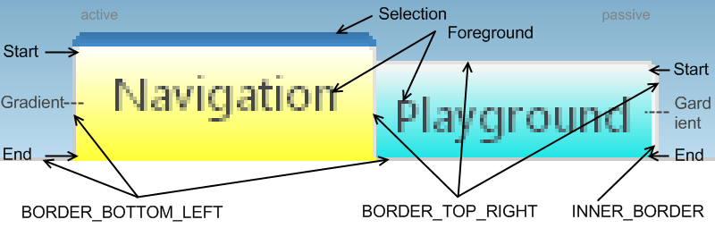 The image above has some strange colors. This colors are used to highlight the gradients.
The texts of the sub-applications have the foreground color (L&F key: SUB_APPLICATION_SWITCHER_FOREGROUND). If the text is disabled the color defined by SUB_APPLICATION_SWITCHER_DISABLED_FOREGROUND is used.
The backgrounds of active and passive switchers have gradients with start and end color:
- SUB_APPLICATION_SWITCHER_ACTIVE_BACKGROUND_START_COLOR
- SUB_APPLICATION_SWITCHER_ACTIVE_BACKGROUND_END_COLOR
- SUB_APPLICATION_SWITCHER_PASSIVE_BACKGROUND_START_COLOR
- SUB_APPLICATION_SWITCHER_PASSIVE_BACKGROUND_END_COLOR
- SUB_APPLICATION_SWITCHER_PROCESS_FINISHED_BACKGROUND_START_COLOR
- SUB_APPLICATION_SWITCHER_PROCESS_FINISHED_BACKGROUND_END_COLOR
The selected (active) tab has an additional gradient at the top. In the L&F only one color is defined: SUB_APPLICATION_SWITCHER_TOP_SELECTION_COLOR. The renderer of this tab calcutates the start and end color.
The border of active and passive tabs are defined with:
- SUB_APPLICATION_SWITCHER_INNER_BORDER_COLOR (resp. SUB_APPLICATION_SWITCHER_INNER_PROCESS_FINISHED_BORDER_COLOR)
- SUB_APPLICATION_SWITCHER_BORDER_TOP_RIGHT_COLOR and
- SUB_APPLICATION_SWITCHER_BORDER_BOTTOM_LEFT_COLOR.
If the tab is disabled then the three keys
- SUB_APPLICATION_SWITCHER_INNER_DISABLED_BORDER_COLOR
- SUB_APPLICATION_SWITCHER_DISABLED_BORDER_TOP_RIGHT_COLOR and
- SUB_APPLICATION_SWITCHER_DISABLED_BORDER_BOTTOM_LEFT_COLOR
are important.
Menu Bar / Tool Bar
- MENUBAR_TOP_MARGIN and TOOLBAR_TOP_MARGIN
- Define the margin at the top of the menu bar and the tool bar of the Riena application.
- TOOLBAR_WORK_AREA_VERTICAL_GAP
- Define the amount of space between the bottom of the toolbar and the work area/navigation.
- NAVIGATION_WIDTH
- On the left side of a Riena application there is always the navigation view. Set the width of the navigation in the Look&Feel with this constant.
- If you change this width, the width of the module-groups, module und and sub-module tree will also be changed; furthermore the width of the working area will be shrunk or grown.
Sub-Module Tree
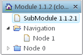
If a module has more than one sub-module, all sub-modules will be displayed in a tree. This tree is inside the view of the module, below the module's title bar. A sub-module can have children. This children are also displayed in the sub-module tree.
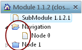
You can define in the Look&Feel what icons should be displayed when a folder is open or closed. Also you can define the icon of a leaf.
- SUB_MODULE_TREE_FOLDER_OPEN_ICON
- will be displayed when a folder is open
- SUB_MODULE_TREE_FOLDER_CLOSED_ICON
- will be displayed when a folder is closed
- SUB_MODULE_TREE_DOCUMENT_LEAF_ICON
- icon of a leaf (node without children)
Marker
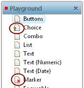
The leaves in the sub-modules can be marked. Currently are three markers, for which you can define additional icons using the corresponding constants:
- ErrorMarker, SUB_MODULE_TREE_ERROR_MARKER_ICON
- values of the sub-module are invalid.
- MandatoryMarker, SUB_MODULE_TREE_MANDATORY_MARKER_ICON
- not all required values of the sub-module have been entered.
- UIProcessFinishedMarker, SUB_MODULE_TREE_PROCESSED_FINISHED_MARKER_ICON
- a process of the sub-module is finished.
By default, marker icons are displayed in front of the corresponding leaf icon in the sub-module tree. If you prefer to have the markers in one place, the following constant can be used to set the global MarkerPosition of markers in a SubModuleTree:
- SUB_MODULE_TREE_MARKER_HIERARCHIC_ORDER_POSITION
- If this property is set, all markers are sorted according to their priority (getPriority() in IMarker) and only the one with the highest priority is painted at the given MarkerPosition.
Markers influence the painting of controls depending on the marker type. Rendering of the DisabledMarker can be configured by the Look and Feel. The following constants are given:
- LnfKeyConstants.DISABLED_MARKER_BACKGROUND [Color]
- The background for the disabled-state rendering.
- LnfKeyConstants.DISABLED_MARKER_STANDARD_ALPHA [int]
- The alpha value of the disabled-state rendering for simple Controls (Buttons, Labels, ...).
- LnfKeyConstants.DISABLED_MARKER_COMPLEX_ALPHA [int]
- The alpha value of the disabled-state rendering for more complex Controls (List, Table, Tree ...).
Dialog
Riena draws an own title bar and border of a dialog, if the setting DIALOG_HIDE_OS_BORDER has the value true.
Title Bar
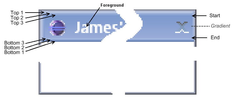
The picture above shows a dialog with a Riena title bar. The text of the title bar has the foreground color (L&F key: DIALOG_FOREGROUND).
The background of the title bar is a gradient with start and end color. The keys of the L&F are DIALOG_TITLEBAR_BACKGROUND_START_COLOR and DIALOG_TITLEBAR_BACKGROUND_END_COLOR.
At the top (left) and the bottom (right) of the Riena title bar are three different other colors to simulate a 3D effect:
- DIALOG_TITLEBAR_BACKGROUND_TOP_COLOR_1
- DIALOG_TITLEBAR_BACKGROUND_TOP_COLOR_2
- DIALOG_TITLEBAR_BACKGROUND_TOP_COLOR_3
- DIALOG_TITLEBAR_BACKGROUND_BOTTOM_COLOR_1
- DIALOG_TITLEBAR_BACKGROUND_BOTTOM_COLOR_2
- DIALOG_TITLEBAR_BACKGROUND_BOTTOM_COLOR_3
Border
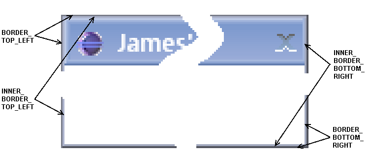
The dialog border is a compound of two (one-pixel) borders. Every border has different colors at the top/left and bottom/right:
- DIALOG_BORDER_BOTTOM_RIGHT_COLOR
- DIALOG_BORDER_TOP_LEFT_COLOR
- DIALOG_INNER_BORDER_BOTTOM_RIGHT_COLOR
- DIALOG_INNER_BORDER_TOP_LEFT_COLOR
Buttons
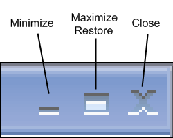
The Riena title bar of a Dialog can have three buttons at the right side and for every button the icon must be defined in the Look&Feel:
Close Button
- DIALOG_CLOSE_ICON
- standard close icon of a dialog
- DIALOG_CLOSE_HOVER_ICON
- will be displayed when the mouse pointer is over the close button
- DIALOG_CLOSE_HOVER_SELECTED_ICON
- will be displayed when the mouse pointer is over the close button and the mouse button is pressed
- DIALOG_CLOSE_INACTIVE_ICON
- will be displayed when a dialog is disabled
Minimize Button
- DIALOG_MIN_ICON
- standard minimize icon of a dialog
- DIALOG_MIN_HOVER_ICON
- will be displayed when the mouse pointer is over the minimize button
- DIALOG_MIN_HOVER_SELECTED_ICON
- will be displayed when the mouse pointer is over the minimize button and the mouse button is pressed
- DIALOG_MIN_INACTIVE_ICON
- will be displayed when a dialog is disabled
Maximize/Restore Button
- DIALOG_MAX_ICON
- standard maximize icon of a dialog
- DIALOG_MAX_HOVER_ICON
- will be displayed when the mouse pointer is over the maximize button
- DIALOG_MAX_HOVER_SELECTED_ICON
- will be displayed when the mouse pointer is over the maximize button and the mouse button is pressed
- DIALOG_MAX_INACTIVE_ICON
- will be displayed when a dialog is disabled
- DIALOG_RESTORE_ICON
- standard restore icon of a dialog
- DIALOG_RESTORE_HOVER_ICON
- will be displayed when the mouse pointer is over the restore button
- DIALOG_RESTORE_HOVER_SELECTED_ICON
- will be displayed when the mouse pointer is over the restore button and the mouse button is pressed
- DIALOG_RESTORE_INACTIVE_ICON
- will be displayed when a dialog is disabled
Embedded Title Bar
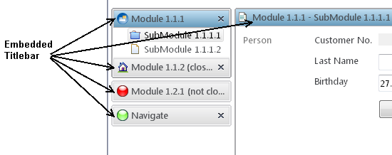
Not only the shell of the Riena application or a dialog have a title bar also other parts of the Riena have a title bar. These can be a module in the navigation or the view of the active sub-module. The name of this title bar is Embedded Titlebar.
The text of the title bar has the foreground color (activated: EMBEDDED_TITLEBAR_ACTIVE_FOREGROUND, deactivated: EMBEDDED_TITLEBAR_PASSIVE_FOREGROUND). The L&F key EMBEDDED_TITLEBAR_ACTIVE_BORDER_COLOR defines the color of the border.
The background of the Embbeded Titlebar is a gradient with start and end color. (EMBEDDED_TITLEBAR_ACTIVE_BACKGROUND_START_COLOR and EMBEDDED_TITLEBAR_ACTIVE_BACKGROUND_END_COLOR)
States
A module can have other states. The following pictures shows the title bar of the same module with different states: active, passive, disabled, active and mouse over, passive and mouse over:
The passive title has other start and end colors and an other border color: EMBEDDED_TITLEBAR_PASSIVE_BACKGROUND_START_COLOR, EMBEDDED_TITLEBAR_PASSIVE_BACKGROUND_END_COLOR, EMBEDDED_TITLEBAR_PASSIVE_BORDER_COLOR
The disabled title bar is similar to the passive. Only the foreground and the border color can be different: EMBEDDED_TITLEBAR_DISABLED_FOREGROUND, EMBEDDED_TITLEBAR_DISABLED_BORDER_COLOR
When the mouse is over a module's title bar, the hover border appears. The top and the bottom of the border has two different colors: EMBEDDED_TITLEBAR_HOVER_BORDER_TOP_COLOR, EMBEDDED_TITLEBAR_HOVER_BORDER_BOTTOM_COLOR. The left and right side of the hover border is another gradient with a start and end color: EMBEDDED_TITLEBAR_HOVER_BORDER_START_COLOR, EMBEDDED_TITLEBAR_HOVER_BORDER_END_COLOR. With EMBEDDED_TITLEBAR_HOVER_BORDER_MARGIN you can define the margin around the hover border.
Close Icon
The Riena Look&Feel also defines the close icon of the module title bar:
- EMBEDDED_TITLEBAR_CLOSE_ICON
- standard close icon
- EMBEDDED_TITLEBAR_CLOSE_HOVER_ICON
- will be displayed when the mouse pointer is over the close button
- EMBEDDED_TITLEBAR_CLOSE_HOVER_SELECTED_ICON
- will be displayed when the mouse pointer is over the close button and the mouse button is pressed
- EMBEDDED_TITLEBAR_CLOSE_INACTIVE_ICON
- will be displayed when a module is disabled
UI Process List
The list that shows all the running UIProcesses (see the blue popup in the image below) can be configured by the following constants:
- STATUSLINE_UI_PROCESS_LIST_BACKGROUND
- the background it the popup (default RGB color: 183, 216, 236)
- STATUSLINE_UI_PROCESS_LIST_WIDTH
- the width of the whole popup including the ProgressBar (default width: 160px)
Look&Feel and View
Inside the working area of the active sub-module almost-standard SWT widgets are used. The properties of these widgets can also changed by the Riena Look&Feel (LnFUpdater).
Unfortunately not all changes of these properties have an effect on the apperance of the widget. So on Windows you can set the font of every widget, but you can only change the foreground color of some widgets: The foreground color of a Text can be changed but not that of a Button.
In the Theme of the Look&Feel you can define the default property values for every kind of Widget:
@Override
public void addCustomColors(Map<String, ILnfResource> table) {
	super.addCustomColors(table);
	table.put("Label.background", getPrimaryBackground());
	table.put("Label.foreground", getPrimaryForeground());
	table.put("Text.background", new ColorLnfResource(null));
	table.put("Text.foreground", getPrimaryForeground());
}

@Override
public void addCustomFonts(Map<String, ILnfResource> table) {
	super.addCustomFonts(table);
	table.put("Button.font", getPrimaryFont());
	table.put("Label.font", getPrimaryFont());
	table.put("Text.font", getPrimaryFont());
}
In order for the Look&Feel to set all these property values, you must set the system property riena.lnf.update.view=true.
Ignore properties of custom widget
With the annotation @IgnoreLnFUpdater you can prevent that the LnFUpdater overwrites the value of a given property. Add this annotation in front of your custom widget class. The parameter of @IgnoreLnFUpdater is the name of one property or an array of property names.
@IgnoreLnFUpdater("background")
public class TextButtonComposite extends Composite {

  public TextButtonComposite(Composite parent, String buttonText) {
    super(parent, SWT.None);
    setBackground(LnfManager.getLnf().getColor(LnfKeyConstants.SUB_MODULE_BACKGROUND));
  }

}
Look&Feel Style
With the Riena L&F you have the possibility to associate the properties of a SWT widget with a simple style of the L&F.
The name of the style will be added to property data of the SWT widget:
Label myLabel = new Label(parent,SWT.NONE);
myLabel.setData(UIControlsFactory.KEY_LNF_STYLE, "sectionLabel");
In the L&F theme the style is defined:
@Override
public void addCustomColors(Map<String, ILnfResource> table) {
	super.addCustomColors(table);
	table.put("sectionLabel.foreground", new ColorLnfResource(10, 10, 200));
}

@Override
public void addCustomFonts(Map<String, ILnfResource> table) {
	super.addCustomFonts(table);
	FontData fontData = getPrimaryFont().getFontData();
	table.put("sectionLabel.font", new FontLnfResource(fontData.getName(), fontData.getHeight(), SWT.BOLD));
}
One prerequisite is necessary: The system property riena.lnf.update.view must set and the value is true.

