Notice: This Wiki is now read only and edits are no longer possible. Please see: https://gitlab.eclipse.org/eclipsefdn/helpdesk/-/wikis/Wiki-shutdown-plan for the plan.
GMF Propsheet Customization With GmfUI
This page is obsolete, it should not be considered. Changes to make it true will never be committed.
Contents
How-to customize property sheet for your gmf editor.
In org.eclipse.gmf.gmfgraph.editor we have customized the property sheet supplied by this editor by customizing gmf.genmodel templates to work with our joint gmfui.ecore metamodel. This had provided us with a framework for customizing property sheets. Actually, gmfui itself is a small framework to customize your form based UI. So in general customizing templates together with providing a joint metamodel for the gmfgen is actually a good example of customizing gmf for making frameworks for it!
But now let’s walk through all the steps needed for using our resulted propsheet framework.
We assume that at the moment you have your specific metamodel, described in .ecore, and have already generated your DSL editor, provided by GMF. And now you want to customize the property sheet for your editor with our propsheet gmfui-based framework.
So how does it work?
We can generate most of the code needed, if you reuse customized templates from org.eclipse.gmf.gmfgraph.editor. More precisely, you need only PropertySection.xpt (along with Utils.ext). If you have a look inside, you will notice, that all the template code comes to is delegate its behavior to nested VisualizationConstructor class. That latter is itself produced by separate VisualizationConstructor template, which in turn use GmfUI metamodel, and its custom code is absolutely independent from your target metamodel. You can also notice, that for general widgets and model functionality this class applies to org.eclipse.gmf.graphdef.editor.uigen.AbstractVisualizationConstructor (it is located in “src-extra” source folder of the project). You can have a glance at it to see the graphical services available. I have mentioned, that this template produces “most” of the code, so actually we still need some NOT generated parts in complicated cases of operating metamodel, so one of the 2 tabs used in our gmfgraph.editor contains such parts (see org.eclipse.gmf.graphdef.editor.sheet.GeneratedLayoutPropertySection).
The main feature of the template engine, which have made it possible to have a framework, is xpand automatic searching for referenced objects within the same resource set. In our graphical description of propsheet widgets we only reference gmf Custom Property Tabs, and gmfgen itself knows nothing of our extension.
Let’s give it a try.
Small tutorial. Part 1. Introduction.
For quick start we will first change already customized tabs of our main org.eclipse.gmf.graphdef.editor plugin. So the first thing you’ll need is checking out this module into your workspace from its CVS location (cvs –d:pserver:anonymous@dev.eclipse.org:/cvsroot/modeling co org.eclipse.gmf/plugins/org.eclipse.gmf.graphdef.editor) in sdk-experimental feature.
The second important thing you have to do first, is bringing our model for swt widgets domain language to life. All we provide is a simple scratch of model. To be able to use it, create and edit elements from it, you need to generate EMF model and editor for your developer platform. To do this, open the gmfui.genmodel, that should exist in the models folder of org.eclipse.gmf.graphdef.editor plugin, and, using Generate Model Code main element context action, generate the org.eclipse.gmf.uigen plugin. After this project is generated, you can Export it as Deployable plug-ins and fragments into your current platform (or import it from the development workbench, if you are currently using target one for work). And do not forget to restart Eclipse workbench afterwards.
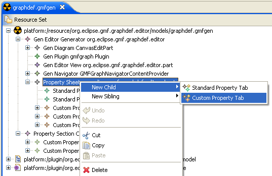
Finally, as one of the most simple, but useful examples, let’s provide users with a way to specify names for figures at last. This functionality was lost when we have switched to customized properties presentation. Since there could be many reasons for Which custom tab should we choose to meaningfully add this text field, let’s simply make a new one. As usual, open the gmf generation model from models/graphdef.gmfgen, and add one more Custom Property Tab child for Property Sheet node (these nodes are part of the common gmfgen description, so you can find them under Gen Editor Generator customization root, as always).
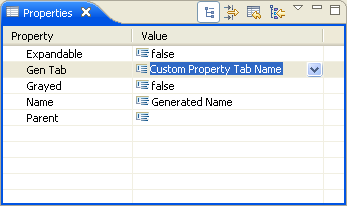
I have given it “genLabel” id and chosen “Name” for its label. I have also changed the implementation class name a little (just to make it prettier), and now it is going to be “GeneratedNamePropertySection”.
Now we need to decide, which objects does it make sense to set name for – and this actually means tiding our property with the metamodel, specifying the blackbox from which the value should be initially taken, and where it should be saved afterwards. Actually, with the normal development flow, you always think of this first, because the metamodel already exists and its properties are already known, and now you are just thinking of how to show them in widgets. So, looking to our domain gmfgraph.ecore metamodel we can notice, that every org.eclipse.gmf.gmfgraph.Identity object can have a name in metamodel, so that tells us of what filter should we add to show our tab: we want the tab to be shown for Identities. OK, let’s add New Child to our Custom Property Tab named Name of type Custom filter, and make it point to the org.eclipse.jface.viewers.IFilter class which would check selection’s type. There are filters for other custom tabs already implemented within org.eclipse.gmf.graphdef.editor.part.PropertySectionFilters (being the custom implementation class, it could be found in src-extra folder as well), and so all we need is making some new static nested class with similar code. Coping ShapeFilter and replacing Shape with Identity works fine for me, so let’s do it.
public static class IdentityFilter implements IFilter {
	public boolean select(Object toTest) {
		Object transformed = PropertySectionFilters.transformSelection(toTest);
		return transformed instanceof Identity;
	}
}
Therefore, we can now set PropertySectionFilters$IdentityFilter as the Implementation class of that added custom filter for our tab. That’s it with gmfgen customization itself.
Now let’s go into our gmfui framework a little. If you have checked the latest graphdef.gmfgen, you should find a second root node, Visualization Constructor. This is our model to let you describe custom widgets to fill your referenced tab and access features from your domain metamodel.
Note : If you have no Visualization Constructor second root, you can now use our new feature for “Adding extension models” for gmfgens, available from the context menu of gmfgen. It should create that second root for you, when you locate gmfui.ecore and select Visualization Constructor to instantiate.
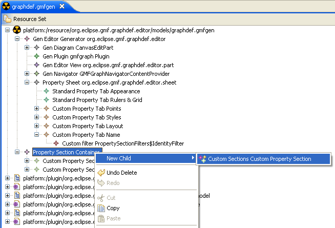
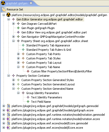
So now locate that second Visualization Constructor root, and add one more Generation Unit child node. You can set the name for it, if you like (I have used Generated Name, similar to the ones used for other tabs). There is one main thing is to be done next. You should specify our Custom Property Tab with “Name” name, created above, as it’s Template Activator reference. Thus you make a reference for genmodel entity, which will let our template customization know that the class, generated by that entity, should use our joint gmfui description instead of a plain table one.
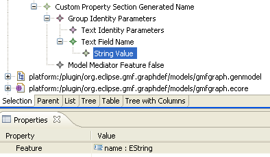
Well, that’s all with the difficulties. Now only fun is left. To our “Generated Name” Generation Unit we can add graphical widgets to make it look as interesting as your imagination can make it up. So let’s play with it a little. I have added Group widget with the TextField (Note, not the plain “Text” one!) widget inside. For convenience, I have given them names, you can do this if you like, too. Besides, if you want to provide some friendly label for your users, you should add a Text element, with the help of which you will be able to turn the label completely off, or providing some custom extended label, that couldn’t be pulled out of the domain metamodel. I have added such Text child for my Group added, and specified “Identity Parameters”.
Well, for now I think that there is enough graphics, and we can go into taking care of interaction with model. At the moment our widgets know nothing about the source from where they could take initial values or save modified ones. So there is not too much use in the code being generated so long. And it is time to breath some life into them.
We have a Text Field, so it is naturally to suppose that it’s value is provided by some metamodel feature of EString type. To use this feature to be source of values you should simply add Model Element Model Feature Reference to the widget and locate your feature from the “Feature” list in the property sheet. For our case I have added String Value to the Name Text Field, and chosen “name : EString” Feature for it.
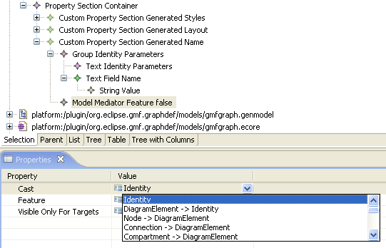
Secondly, let’s tell templates the concrete metamodel type we are going to operate within this tab. Actually, we have already provided this information with the help of Custom filter for the Custom Property Tab Name, so this is actually a little duplication of information. But the way we have done this in a filter I like less, so it is doubtful which one is to be improved. So to tell the target metatype for the tab we should add Model Mediator to Custom Property Section or any Group element. Why should it be available for any Group element widget, you may wonder. Actually, Model Mediator element is highly used by our customized templates to provide model-operating code. Group widget is logically used in two different senses, as a graphical widget (SWT Group(expandable=false) or FormsUI ExpandableComposite (expandable=true) if it doesn’t contain explicit Text element with Create Label set to false, and plain Composite otherwise), and as well a grouping element for referenced model features. Now we need to specify the metaclass to which the structural feature we have used in String Value Model Element belongs. So we add Model Mediator element and select Identity classifier from the list available for its Cast property.
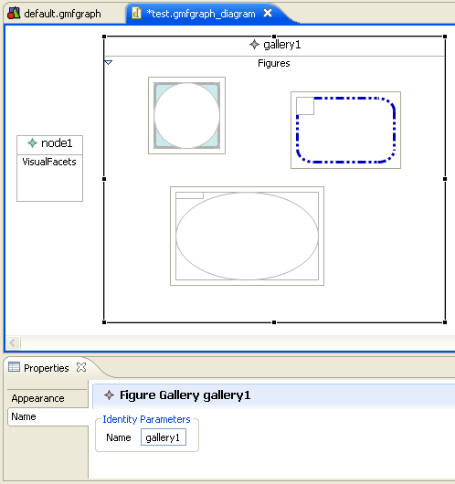
OK. I think that is enough for the first iteration. And it is more interesting to take a look at the result now. Let’s “Generate diagram code” and run the editor. Look! It does work indeed. :)
Small tutorial. Part 2. Model elements concepts.
With the help of Feature References in gmfui you can teach your widgets to interact with model element.
- Model Mediator Feature. Downcasts input element to the specified type from Cast field, and passes that typed element to contained Model Feature References. And/Or uses its Feature referenced to extract input element for its children from that feature. Of course, that last makes sense only if you reference some composite type, or some compound widget. Therefore, only Group widgets, which are capable only of containing another ui elements, but not related to any model information, can contain such reference, for what it was called Mediator.
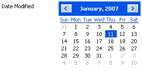
- Model Feature Reference – it is the most common way to control widgets model interaction. You drop a reference to some feature into your widget, and it enables you to get and set model information with that widget. Yes, it is that simple. The main thing about all these is showing your smart model entities with poor computer visual representation. Most of the widgets provide only several settings they can be configured with, usually these are some String or Boolean or Int parameters. For instance, configuring Calendar with int Day value highlights that day in the month`s squared numbers list. Though it is more or less obvious how TextFields should treat your String, or even Int and Boolean-typed attributes, but since you have Color value, it makes a big deal for that TextField to handle. Nevertheless, still you are welcome to use any model element you like. There is special very extensible mechanism provided by gmfui. It is called DataTypeConversions. Have a look at xpt::uigen::DataTypeConversions.xpt. You can add "convertTo[String,Boolean,Int]" and "createFrom[String,Boolean,Int]" for setting up corresponding widgets right in the language they speak (TextField, TextArea, Label, Combo are controlled by Strings, Checkbox and Radio by Booleans, Spin by Ints, everything is naturally). However, we have tried to generalize handling DataTypes where possible, so in most cases you will have enough to start with, like using Strings from your type`s EFactory.convertToString (and EFactory.createFromString) and so on. But we have provided for you even more, see below.
- Is Feature Of Type Reference – this is some not so trivial reference. Imagine the situation, when you want the source of model information to be not real feature, but another sign, like the one Type information provide us with. Consider having a team of programmers, and you want to fill a checkbox for each, telling whether he is a boy or a girl. But you`ve got in your model much more useful attributes, than their sex, and that information could only be obtained by examining their type directly. Thus you add Checkbox widget, with Is Feature Of Type Reference, pointing with its 'isOfType parameter to, for instance, a Girl (for now GenGirl, actually). Till next member is a Girl, it will be checked, and cleared in the opposite case.
- Is Feature Of Kind Reference – another handy thing we cared for you is enhanced handling of Enumeration info. Admit that standard UI widgets concept is sometimes too poor to express the creatures of our models we have. But some of their properties can better be described by an image. Let`s take music notes, or guitar chords, for example. Suppose you have Enumeration of basic guitar chords, and for starters you’d like to render some sounds playing with switching the radio button between the pictures of the current chord held. So what you’ll need is having a Group of Radio widgets (one for each chord supported), and provide that Group with Model Mediator Feature with its feature pointing to the Enumeration-kind model one. Children Radios of the Group should be given with our Is Feature Of Kind Reference. Each of that references should point to the "values" feature of your Enumeration, and with the help of isOfValue parameter, configured with EnumerationLiteral for particular chord in the enumeration. As Radio widget supports Icons, you can provide a picture with finger positions for each.
Small tutorial. Part 3. Widgets concepts.
This section describes existing widgets available within our framework to be added to the property sheet.
Layout and LayoutData.
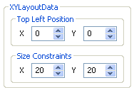
At the moment (GMF2.0) whole gmfui framework offers the only layout, FormLayout, and all widgets location can be controlled with solely one way, by tuning their child Form Layout Constraint.
Tip : To clarify yourself of how it is working you can have a look at the org.eclipse.gmf.graphdef.editor.uigen.AbstractVisualizationConstructor.createFormData method.
You can tune Form Layout Constraint with 2 major parameters: Anchor Control and Relative Position, so to display some widget to the right of another, you should add Form Layout Constraint child to it, and set that other widget as Anchor Control, with Relative Position = LEFT.
Note : If no Form Layout Constraint specified, default widget position is set to be the topmost and leftmost. So you can always omit Form Layout Constraint for the top left (often the first one) widget in the container for your convenience.
Tip : The easiest way to place your widget at the lower right corner (IV quarter) is adding 2 invisible labels with whitespaced text, the second one below the first one, and specifying that lower label as your widget’s Left Anchor Control.
Group
Group has the largest number of use cases and varieties. Group is the entity for containing other widgets, i.e. grouping them by some qualities.
Purposes for such grouping can be quite different :
- Layout. Building complex compound layouts of control. Group acts as layout container, so all the widgets inside get a chance to specify their layoutData anchors relative to the contents of the group only.
- Model specialization. In most cases we specify concrete feature to get and set value for our widgets, but additionally we need some mediator layer. The simplest thing it serves for is specifying metaclass this feature should belong to. So that we could generate in our code something like casting input object to that metaclass and call the feature getter/setter on that metaclass. More sense appears for that layer in little more complicated cases. Consider, for example, the case, when you would like to set or get value for the class instance, that your target instance can return (something like Points, Dimensions or LayoutDatas), but you do not want to have a separate tab for that. In such cases you should add a Group with Model Mediator child and set its Feature property to reference the feature that should return the target metaclass for all widgets inside that group could operate.
Note : There are some cases when modification listeners do not react on just changing instance fields of that contained objects, but only on changing the whole instance. In order not to lose other instance settings, you should implement EObject cloneVars(EObject target) method yourself (see GeneratedLayoutPropertySection.VisualizationConstructor.ModelHelper.cloneVars for an example).
The other use case of Model Mediator is making specific parts of your tab appear only for definite subclasses of the target tab one. For example, you want some parameter widget to appear only if your metaclass instance is of Editable subtype. You can get that behavior by adding Group with child Model Mediator Feature, which Cast references Editable subclass and Visible Only For Targets flag turned on, and afterwards adding your feature-modification widget to that Group.
Their visual representation can vary too .
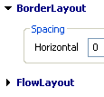
- SWT Group (if Expandable=false)
- FormsUI ExpandableComposite (if Expandable=true)
- SWT Composite (if contains Text element with Create Label=false)
Label
Checkbox
Radio
Spin
Text Field
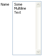
Text Area
Do not forget to configure LayoutConstraints accordingly (for instance, making it, or its container Group, rightmost and lowermost)
Time
Date
Combo
Back to GMF Propsheet Customization
Back to GMF Documentation

