Notice: This Wiki is now read only and edits are no longer possible. Please see: https://gitlab.eclipse.org/eclipsefdn/helpdesk/-/wikis/Wiki-shutdown-plan for the plan.
Field Decorators and Validation
This document describes design ideas pursued during the development of Eclipse 3.2 that were never fully implemented.
Bug 237372 tracks this issue.
This document describes Use Cases and Solutions for field decorators of (1) Content Assist, (2) Required Fields, and (3) Errors/Warnings. Each of these indicators are shown in various UI contexts, such as Dialog Boxes, Wizards, and Forms, in order to describe the design issues and apply a consistent solution where possible. The main techniques that are described in the Blueprint Specifications and Solutions refer to icon/text treatment (size and position) at the Control-level, as well as messages at the UI-level.
| Indicator (cue) |
|
|---|---|
| UI Controls or Area |
|
| UI Context |
|
Content Assist
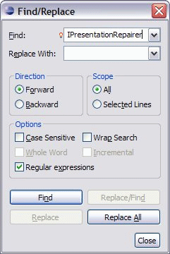
Figure 1.1 Find/Replace Dialog - Combo Box
Lightbulb overlay is middle-aligned vertically with the combo box and text labels, when the field has focus
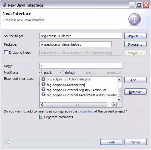
Figure 1.2 JDT New Java Interface Dialog - List Cell Editor
Lightbulb overlay is placed to the left of the list box, when the list item has focus.
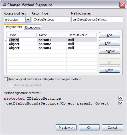
Figure 1.3 JDT Change Method Signature Dialog - Table Cell Editor
Lightbulb overlay is placed to the left of the table, when the row has focus.
Required Input
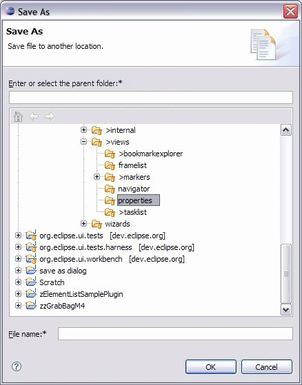
Figure 2.1 Save As Dialog: Parent folder and file name fields - Text Field
Asterisk is placed after the text label and colon.
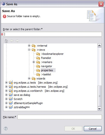
Figure 2.2 Save As Dialog: Input error - Text Field, Header (banner)
Asterisk is placed after the text label and colon; Error icon with message replaces the description in the top banner info area; Large error icon provides association with the text field indicator inside the dialog page.
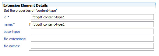
Figure 2.3 PDE Form - Text Field
Asterisk is placed after the text label and colon; Lightbulb overlay is middle-aligned vertically with the combo box and text labels.
Error and Warning Messages
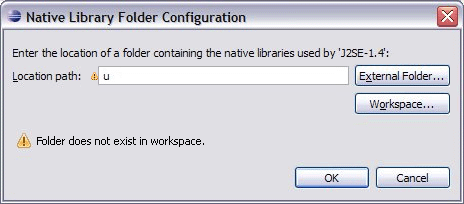
Figure 3.1 Native Library Folder Configuration Dialog: Input error - Text field, Body of dialog
Warning indicator is placed to the left of the text field.
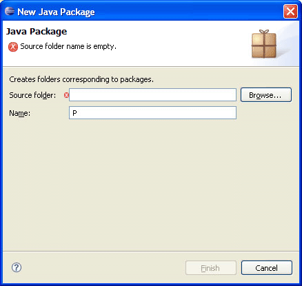
Figure 3.2 New Package Wizard - Text Field, Header
Error icon with message replaces the description in the top banner info area; Large error icon provides association with the text field indicator inside the dialog page.
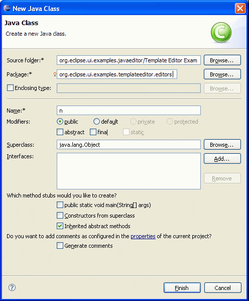
Figure 3.3 New Class Wizard - Text Field, Header
Asterisk is placed after the text label and colon; Content assist icon is placed to the left of text field; indicator inside the dialog page. Warning icon with message replaces the description in the top banner info area; Large error icon provides association with the text field
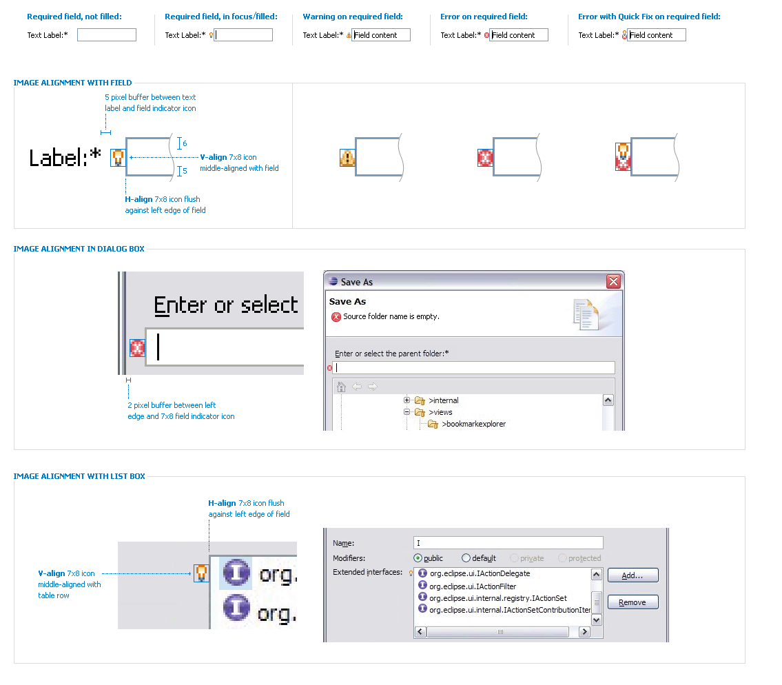
Blueprint Specifications
Note: Fields (and the dialog space surrounding the field) are not to grow/shrink due to presence/absence of the decorator, so it is the responsibility of the dialog designer to allocate space for it.

